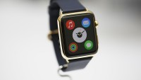
Five Reasons Not to Buy the Apple Watch
| David Curry | | Apr 12, 2015 01:54 AM EDT |
(Photo : Reuters)
(Photo : Reuters)
(Photo : Reuters)
The Apple Watch seems to be a polarizing device to most people. Even if the general consensus on the internet is the device sucks because, curse Apple, many customers still seem keen dropping $350+ even though cheaper alternatives are available.
While there are some good reasons to own the Apple Watch, like being an early adopter; checking out the first apps and getting the first complete smartwatch when it comes to software and hardware synergy, it doesn't surpass the mounting issues with the first generation.
Like Us on Facebook
Here are five of our biggest gripes with the Apple Watch:
1. The iPhone companion
Even though it's necessary right now to have all notifications sent to the Watch through an iPhone via Bluetooth or Wi-Fi, it still doesn't make the experience any better. It makes the Watch feel like an accessory to the iPhone, or more importantly, the iPhone an accessory to the Watch.
Apple's end goal might be for owners to have a watch or phone but right now the idea of carrying an iPhone and Apple Watch is pretty dumb. Firstly, the Apple Watch is slow when it comes to loading the home screen, meaning it's just as quick to pull your phone out of a pocket or bag.
Secondly, the Apple Watch is a terrible device for responding to notifications. If you get a tweet or email, it forces you to switch to the iPhone to respon, because dictation and auto-replies are both incredibly basic even for less than 140 characters.
2. Battery life & charging
One of the massive compromises of moving from a regular watch to a smartwatch was having to charge it. Pebble gets over this hurdle by offering a week long battery life -- meaning you almost forget it needs power to work -- but with the Apple Watch, it's a constant reminder.
The Apple Watch is such an active device you're always wondering when it's going to finally drift off. Thankfully, the battery life isn't horrendously terrible and might last a full day (if you work 9 to 5 and spend time at the gym).
But this might be a bit tricky, especially if you plan on replying to notifications, browse feeds and have imported notifications or music from the iPhone.
3. Poorly optimized system and apps
Apple spent so much time hiding the system from developers and critics the Apple Watch hasn't had enough time in the wild to fix bugs; optimize for specific applications or get a sense of how millions of customers are planning to use the smartwatch.
It leaves the Apple Watch in a rut where it doesn't have enough usable feedback to make instant bug fixes or optimizations without potentially jeopardizing parts of the system. We expect with more small updates the slow speeds, load fails and crashes will become less prevalent.
Some app developers also seem to be figuring out the UI for the Apple Watch, which is much more basic than iOS 8 or Android Lollipop. The introduction of Force Touch (which we'll touch on later) is also a factor playing into the minds of developers when creating an app, although not many seem to offer good solutions to the new touch interface
4. Odd Physical Buttons
When the iPad first launched, it was criticized as "a bigger iPhone" because the button layout was identical. Turns out, that was a major plus for Apple customers that bought the full package because it becomes second nature where the on/off, volume and home button are placed.
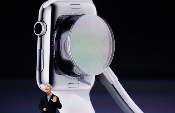
That's tossed away with the Apple Watch. It features a digital crown that acts as the zoom in/out scroller and the home button, alongside a side button with the exact same ergonomics as the on/off button on the iPhone. This button on the Apple Watch, however, is used for favorites and Apple Pay purchases.
Throwing everything out the window is really bad for iPhone or iPad users. Even after a few days of use, the Apple Watch is still foreign when it comes to its buttons. This might be useful in the future if Apple intends to make the Apple Watch a standalone device
5. Force Touch
Apple's new way to make things more confusing for app and web developers. Force Touch allows the Apple Watch screen (or MacBook trackpad) to notice the force in a tap, changing the following function in response.
The problem is Apple's detection system is way off when it comes to force and using it brings a lot of mistakes. Thankfully, there's a way to set Force Touch to be less of an annoyance although we can't see Apple giving up on this functionality easily
Extra: The Milanese Loop
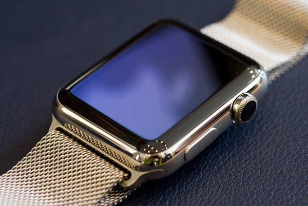
It seems like the milanese loop is one of the least popular choices. Compared to the leather loop, the metal buckle and even the link bracelet -- which is also quite poorly designed, even though the black option does help its cause -- the milanese loop stands out as a failure in terms of design.
It's not that the milanese loop is unappealing aesthetically, it's just a rather animated strap compared to the others. While the sports band and leather loop are discrete and distant, the milanese loop is quite in your face and overly attractive, and not in a good way.
TagsApple Watch, smartwatch, iPhone
©2015 Chinatopix All rights reserved. Do not reproduce without permission
EDITOR'S PICKS
-

Did the Trump administration just announce plans for a trade war with ‘hostile’ China and Russia?
-

US Senate passes Taiwan travel bill slammed by China
-

As Yan Sihong’s family grieves, here are other Chinese students who went missing abroad. Some have never been found
-

Beijing blasts Western critics who ‘smear China’ with the term sharp power
-

China Envoy Seeks to Defuse Tensions With U.S. as a Trade War Brews
-

Singapore's Deputy PM Provides Bitcoin Vote of Confidence Amid China's Blanket Bans
-

China warns investors over risks in overseas virtual currency trading
-

Chinese government most trustworthy: survey
-

Kashima Antlers On Course For Back-To-Back Titles
MOST POPULAR
LATEST NEWS
Zhou Yongkang: China's Former Security Chief Sentenced to Life in Prison

China's former Chief of the Ministry of Public Security, Zhou Yongkang, has been given a life sentence after he was found guilty of abusing his office, bribery and deliberately ... Full Article
TRENDING STORY

China Pork Prices Expected to Stabilize As The Supplies Recover

Elephone P9000 Smartphone is now on Sale on Amazon India

There's a Big Chance Cliffhangers Won't Still Be Resolved When Grey's Anatomy Season 13 Returns

Supreme Court Ruled on Samsung vs Apple Dispute for Patent Infringement

Microsoft Surface Pro 5 Rumors and Release Date: What is the Latest?
